
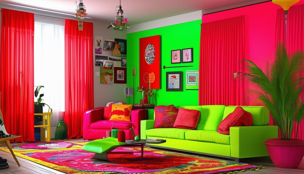
Certain color combinations in home interiors should be avoided to maintain visual harmony. Pairing bright red with lime green often results in a visually discordant space, as both colors compete for attention.
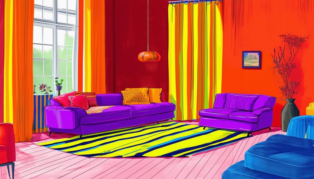
Combining orange with purple may disrupt visual cohesion, leading to a chaotic appearance. Using navy blue alongside black can diminish contrast, potentially making rooms appear smaller and more somber.
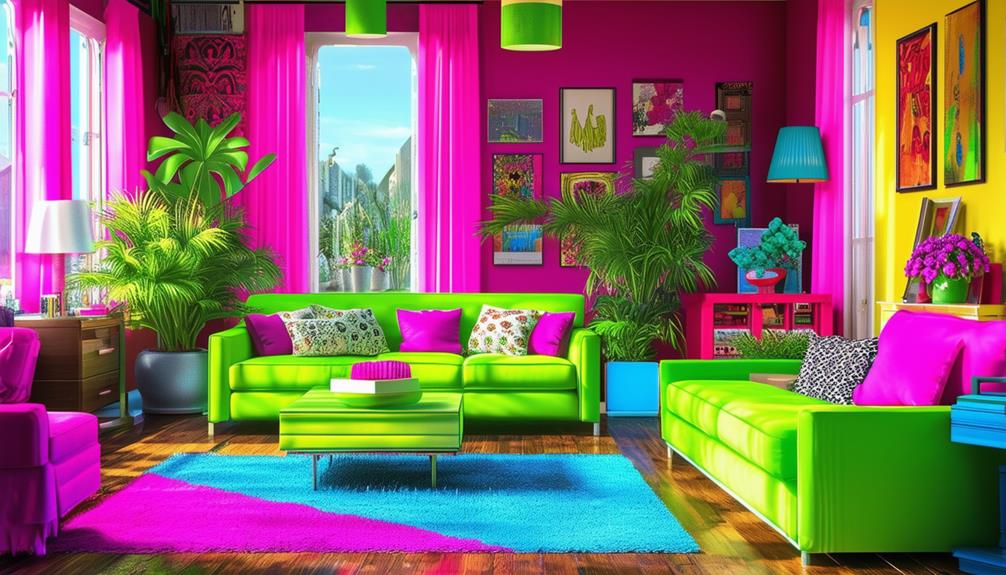
Additionally, excessive use of vivid colors without incorporating neutrals can cause visual fatigue. Understanding the interactions between different colors can significantly improve the aesthetic and balance of your interior spaces.
Clashing Color Pairs to Avoid
When redecorating, avoid combining bright red with lime green. These colors often result in a visually uncomfortable environment and contradict current interior design trends that emphasize harmony and balance. Such combinations can disrupt the aesthetics of a space.
Orange mixed with purple, despite being complementary colors on the color wheel, can overwhelm the eyes in interior spaces due to their intense hues. This combination can detract from a home's desired ambiance.
Pairing navy blue with black might appear sophisticated, but it often leads to a visually unappealing space that seems smaller and less welcoming due to the lack of contrast.
Understanding the impact of these color combinations is crucial for maintaining a balanced and visually appealing environment. Avoiding these specific pairings can enhance the aesthetic quality of your decorating projects.
Overusing Bold Brights
Incorporating numerous bold colors in a single room can lead to visual overstimulation. To avoid this, it's essential to use these vivid colors as accents rather than primary tones. This strategy helps prevent colors from clashing and ensures that the room remains visually balanced.
Proper placement of bold colors enhances the space without causing visual fatigue. By limiting the use of intense hues, the room's aesthetic achieves harmony, ensuring a pleasing environment.
Visual Overstimulation Risks
Excessive use of bold and bright colors in interior design can overwhelm the visual senses and create disarray. It's crucial to balance these colors with neutral tones to avoid an overly intense environment.
Instead of applying vibrant colors broadly, it's advisable to designate them to specific focal points or accents. This approach helps maintain a harmonious atmosphere while still incorporating dynamic elements.
Balancing Color Dynamics
In interior design, effectively managing color dynamics is crucial to achieve both vibrant and balanced environments. Combining bold, bright colors with neutral tones often proves beneficial.
By utilizing bright colors as accents, rather than primary elements, and limiting their application, spaces maintain visual harmony without appearing overwhelming. Neutral tones serve to balance the vibrancy of bold colors, ensuring the space remains inviting.
These strategies are essential for creating visually appealing interiors that enhance the overall atmosphere without compromising on style or comfort.
Ignoring Neutral Balances
Ignoring the balance of neutral colors risks compromising the visual cohesion of a space. Neutral colors, including beige, gray, and white, serve as a foundational element that supports the integration of bold colors and patterns. These shades are essential for creating a sophisticated and timeless appearance.
Overlooking neutrals can result in a lack of atmospheric cohesion in a home. This is comparable to attempting to complete a puzzle without the corner pieces; without a foundational base, vibrant colors may fail to form a harmonious whole. Neutral tones provide a calming effect, balancing the vibrant energy of brighter colors and ensuring the decor is a curated collection of elements.
Incorporating neutral tones in home decor is crucial for achieving a balanced and appealing interior. These colors aren't merely supplementary but are central to creating an aesthetically pleasing environment.
Misguided Color Psychology
Utilizing foundational colors establishes a calm environment, yet precise application of color psychology enhances the emotional ambiance of a space. Incorrect application may result in a choice of colors that don't match the intended emotional and behavioral influences, leading to a discordant atmosphere that feels unwelcoming.
For example, red, known to evoke passion and energy, when used excessively, can make a space feel overwhelming rather than energizing, as calmness is overshadowed by intensity. Conversely, green, associated with calmness and serenity, might make a space feel overly subdued and lacking in visual interest if used exclusively.
Achieving the right balance between these colors is crucial. This approach ensures that the colors complement each other, preventing the creation of spaces that provoke unintended emotions.
Overlooking Lighting Effects
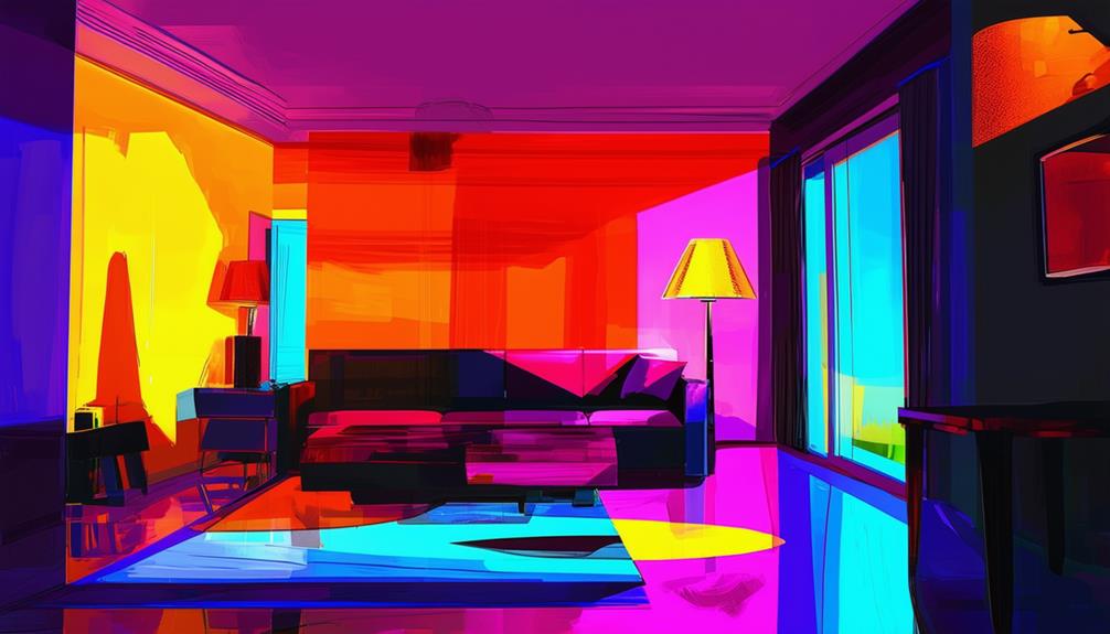
Lighting significantly influences color perception in interior spaces, affecting the mood and design effectiveness. Ignoring lighting's impact may result in an ambiance inconsistent with the desired aesthetic. Soft lighting from lamps or candles tends to soften colors, enhancing tranquility in relaxation-focused areas.
Conversely, the choice of lighting can either enhance or diminish the effect of selected colors. Warm tones often thrive under yellow-hued lights, creating a cozy atmosphere. Cool tones perform better under bright, white lights, maintaining their sharpness and contributing to a vibrant environment.
Strategic use of lighting also involves enhancing textures in the design scheme. Proper shadows and highlights can emphasize textures, adding depth and interest to a space. It's crucial to select lighting that complements the room's colors and textures, ensuring they enhance rather than detract from the overall design.
Forgetting Space Harmony
When designing a room, consider the primary function of the space before selecting colors and patterns. Clashing colors can disrupt the harmony of the room, while an excess of patterns may interfere with its purpose.
Decorative choices should enhance the space's functionality and aesthetic coherence.
Clashing Color Schemes
Selecting color schemes that clash disrupts the visual harmony of an interior space, leading to a visually chaotic environment. When designing a room, consider how colors interact. Clashing color schemes may cause the interior to appear disjointed and unbalanced, reducing its aesthetic appeal.
Overlooking harmony can result in colors that overwhelm the eye and create a chaotic living environment. For visual harmony, coordinate color choices carefully. Avoid harsh combinations, as they can create an unpleasant atmosphere. The objective in interior design is to establish a cohesive and inviting space.
Overwhelming Pattern Mixes
Clashing colors disrupt visual harmony, much like excessive pattern mixing can create chaos in a living space.
In small living rooms, particularly those with limited natural light, selecting an appropriate color palette is crucial.
Though adding various patterns might seem an effective strategy to enhance visual interest, it can lead to a disorganized appearance without careful coordination.
Balancing pattern scales is a proven method to add depth while preventing sensory overload.
Harmonizing patterns through consistent colors ensures a cohesive living environment.
The objective is to enhance the room's appeal without dominating it.
A balanced approach preserves the serene and inviting quality of the space.
Disregarding Room Function
Optimizing home color schemes enhances each space's intended use, ensuring a cohesive environment. Ignoring the function of a room can lead to uncomfortable or disjointed spaces.
For example, living areas benefit from vibrant tones conducive to social activities, whereas such colors may prove too stimulating for bedrooms designed for relaxation.
Bedrooms benefit from muted, calming colors that aid in sleep. Workspaces require color palettes that support concentration and creativity, yet remain unobtrusive.
Balance and interaction of colors across various rooms are crucial for maintaining a harmonious home environment. Color selection must align with the activities designated for each room.
Neglecting Architectural Context
When choosing interior colors, it's essential to evaluate the architectural elements present to ensure the space achieves a unified appearance. Consider the relationship between your color choices and these elements. For example, in small interiors with limited natural light, dark shades can create a perception of depth, contrary to the common belief that they make spaces feel smaller. The key lies in balancing these hues with the available light and the dimensions of the room.
In contrast, large spaces with abundant natural light may appear overpowering with excessively dark colors. Light colors are preferable as they enhance the brightness and sense of space, preventing the room from feeling confined.
The addition of white or pale grey trim plays a significant role, suitable for both small and large spaces. This trim establishes a clear, defined boundary that complements both light and dark wall colors, contributing to an atmosphere of openness. This strategic choice helps maintain architectural coherence, ensuring all elements coalesce into a cohesive aesthetic.
These guidelines assist in making informed decisions about interior color selection, optimizing the spatial qualities of any room while respecting its architectural integrity.