
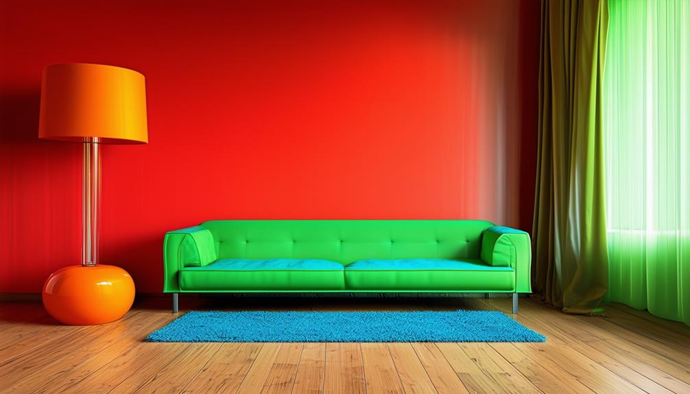
In interior design, it is crucial to avoid color combinations that clash to ensure a visually harmonious environment. Combining mismatched undertones, such as warm oranges with cool blues, often results in visual discordance.
It is also vital to consider the intensity of colors; vibrant shades can dominate subtler ones without proper balance. Additionally, maintaining a balance in color saturation is crucial. An excess of bold colors without the incorporation of neutral tones can create a chaotic visual experience.
Each color choice should aim to enhance the overall cohesion of the space. Exploring these principles further will assist in improving the aesthetic quality of your home.
Overlooking Color Harmony
Overlooking color harmony in interior design leads to visual disruptions that compromise the aesthetic and functional quality of a space. When colors in a room don't coordinate, the environment can appear chaotic and uncomfortable. Such disorganization in color coordination may make a room appear smaller and more confined than it is.
Understanding color relationships is crucial for maintaining unity in interior design. Color harmony involves selecting shades that not only appeal to individual tastes but also function well together to create a cohesive atmosphere. This strategy contributes to an environment that's both purposeful and welcoming.
When colors don't match, it disrupts the spatial perception and can be visually confusing, negatively impacting the overall ambiance of a room.
Ignoring Color Intensity
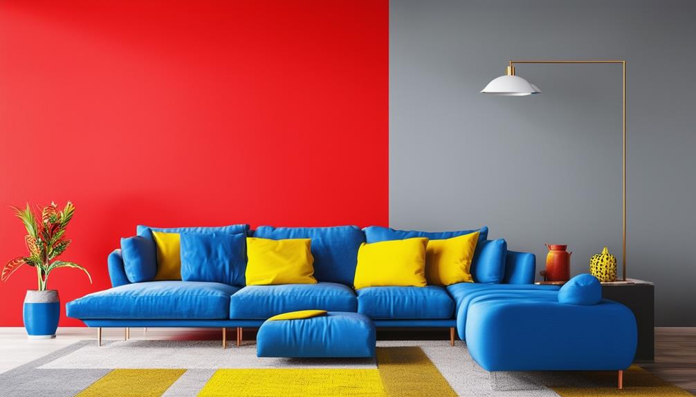
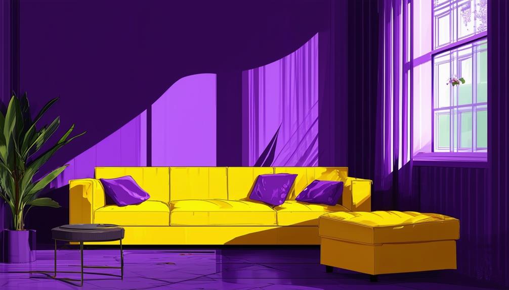
Ignoring the intensity of colors in interior design can lead to a lack of harmony, as vibrant shades may overpower muted ones. In a space, consider how various color intensities interact. For example, pairing a bold electric blue with a soft pastel yellow could result in the blue dominating, making the yellow appear insignificant. A better choice might be a deep mustard yellow with the vibrant blue, creating a balanced, contrasting effect that adds depth and interest without overwhelming.
Effective use of contrasting color intensities can enhance a space if managed properly. Designers should aim for the right balance of color intensities to ensure a smooth flow, avoiding designs that are either too monotonous or too chaotic. This strategy aids in maintaining a visually pleasing environment.
Misjudging Color Saturation
In interior design, balancing intense colors is essential to avoid overwhelming a room.
Enhancing subtle colors ensures they remain noticeable and don't blend unnoticed into the decor.
Achieving this balance is crucial for creating a space that feels harmonious rather than chaotic or uninspiring.
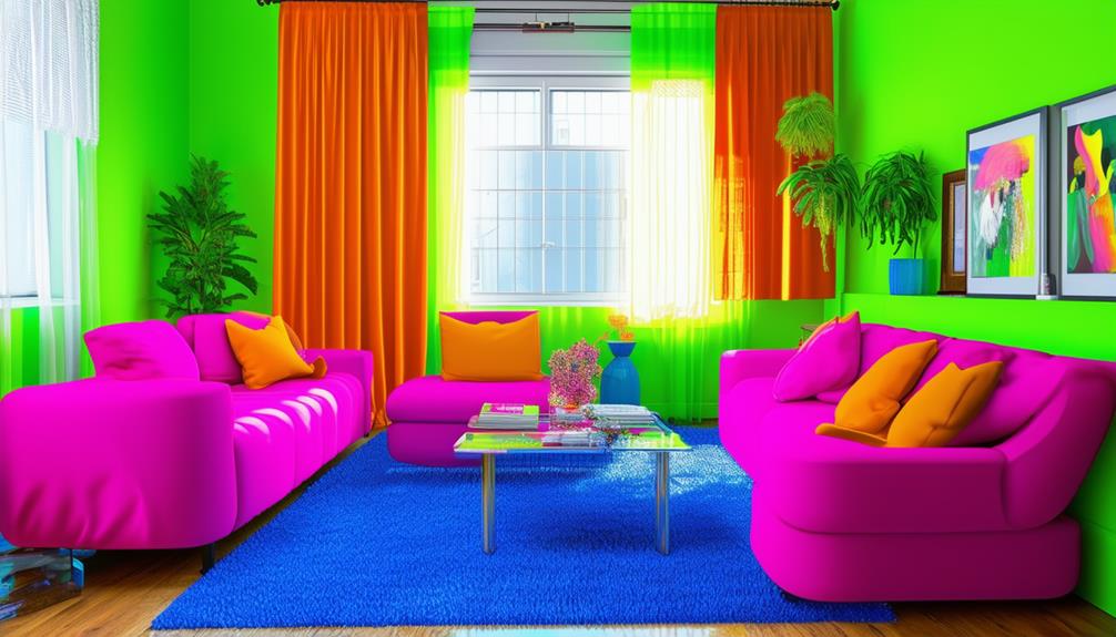
Balancing Bold Tones
Misjudging color saturation can transform bold design choices into an overwhelming visual experience. When working with bold tones, assessing the intensity of each color is crucial to avoid a visually chaotic space.
Understanding how colors interact based on their saturation levels is essential for creating a cohesive and appealing environment. Focused attention on the balance of these tones ensures that each color complements the others, enhancing the space without excessive intensity.
Enhancing Subtle Hues
Adjusting the saturation of subtle hues is crucial in interior design to prevent a flat or uninspired appearance. Proper management of color saturation ensures depth and vibrancy within these hues. Achieving the ideal balance is essential; insufficient saturation leads to pale colors, while excessive saturation may dominate the design.
Subtle hues play a vital role in creating the desired ambiance, standing out sufficiently to enhance the mood and visual appeal of a space. Effective color saturation adjustment is key to a harmonious and sophisticated interior.
Neglecting Color Psychology
Grasping the fundamentals of color psychology is essential in interior design, as it significantly influences emotions and perceptions. This understanding facilitates the selection of colors that enhance the aesthetics and functionality of a space. Ignoring these principles can lead to choices that create visual and psychological discord.
For instance, selecting a vibrant red for a bedroom without acknowledging its stimulating effects may hinder relaxation. Conversely, using excessive gray in a living area can reduce the atmosphere's vitality, contrary to creating a calming environment. Each color selection impacts mood distinctly and should be considered carefully.
Incorporating color psychology effectively can prevent aesthetic and emotional conflicts in interior design, ensuring a more pleasing and functional living space.
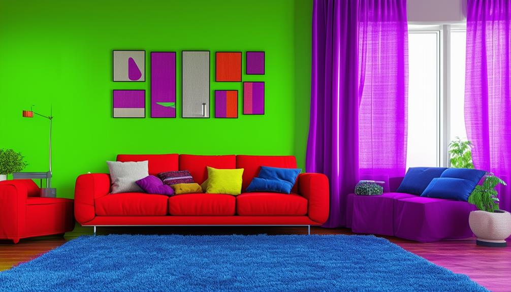
Overusing Bold Colors
When decorating your space, the use of bold colors requires a strategic approach.
Opt for complementary shades to ensure a cohesive aesthetic.
Excessive use of bold colors without strategic planning may result in a disorganized and visually unappealing space.
Balancing Bold Impact
Excessive use of bold colors in interior design can lead to visual chaos as these colors compete for attention, detracting from focal points.
To achieve harmony in a space, it's effective to integrate neutral tones with bold colors. Utilize bold colors as accent pieces rather than primary decor elements. This strategy ensures a significant impact without overwhelming the space.
The objective is to enhance, not overpower, the interior with intense colors. By adhering to these strategies, each color will serve a distinct purpose, promoting a cohesive and appealing environment.
Selecting Complementary Shades
To optimize visual appeal in interior design, it's crucial to select complementary colors, particularly when integrating bold shades. Bold colors can enhance the interior's personality and energy, yet their use requires careful moderation to ensure they serve as highlights rather than dominant elements.
Strategically pairing bold colors with neutral tones helps prevent visual clashes and maintains aesthetic harmony. This approach ensures that the vibrant colors serve as focal points, enriching the decor without overwhelming the senses.
Forgetting About Lighting Effects
Ignoring lighting effects can significantly change the perceived colors in a room, affecting its ambiance. It's crucial to consider both natural and artificial lighting when selecting colors for interiors. The room's orientation influences the amount of natural light it receives, which alters how colors appear throughout the day.
In north-facing rooms, where light is cooler, warm tones can make the space feel more inviting. Rooms with abundant sunlight benefit from bright colors, which can make the area appear more vibrant and active. However, natural light alone may not suffice. Artificial lighting must be used strategically to enhance color choices, particularly in less sunlit areas.
Selecting appropriate bulbs is essential. LEDs, for example, are available in various color temperatures that can influence a room's ambiance. Warm lighting can reduce glare and add warmth by softening bright colors, while cool lighting can make cool colors look sharper and clearer. Understanding how different lighting sources interact with colors is key to optimizing a space's aesthetic.
Disregarding Natural Light
Color selection for rooms must account for the varying levels of natural light, which significantly impacts visual perception and spatial dimensions. Rooms with substantial sunlight benefit from light colors, which make the space seem larger. Conversely, dark colors in sunlit rooms may make them appear smaller.
Rooms facing north typically receive less direct sunlight. Warm colors are advisable here to maintain a cozy atmosphere. Rooms facing south, with plentiful sunlight, are well-suited for cooler colors, which maintain warmth without feeling impersonal.
In decorating, the entry point of natural light into a room is a critical consideration. This strategy ensures that colors align optimally with the room's lighting conditions, enhancing both mood and appearance efficiently.
Mixing Incorrect Undertones
Understanding the undertones of colors in your space ensures that elements such as paint, furniture, and decor complement one another. Natural light impacts color perceptions, highlighting the importance of whether undertones are warm, like those in yellows and reds, or cool, such as blues and greens. Combining these can disrupt visual harmony, resulting in a space that feels unbalanced.
Undertones affect color interactions, which are crucial for the overall ambiance and design of a room. A mismatch of undertones might lead to a visually displeasing environment. To prevent this, careful consideration of undertones is essential before finalizing color schemes. A room achieves visual harmony through the alignment of undertones across different elements, enhancing the space's aesthetic appeal.
Ensure that each color choice supports a cohesive appearance by focusing not only on the primary color but also on the underlying hues. This approach helps in creating a unified and appealing space.