
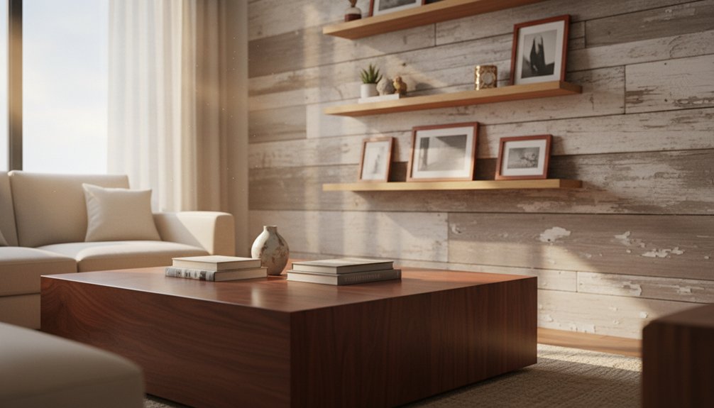
Mixing wood tones effectively enhances interior design. Start by applying the 60-30-10 rule. Designate one wood tone as the dominant choice, covering 60% of your space. Select a secondary wood tone for 30% of the area, and choose an accent tone to represent the final 10%.
Focus on the undertones of the woods. Warm woods, like cherry, harmonize well with each other. Cool woods, such as ash, also complement one another. To avoid a cluttered look, place lighter woods in areas where you want to create brightness. Use darker woods in spaces where you want to add elegance and sophistication.
By implementing these strategies, you can transform the aesthetic of your home while maintaining a cohesive design.
Understanding Wood Undertones and Color Families
To effectively mix different wood tones in your space, you need to understand the color characteristics of each wood species. Each wood has distinct undertones that fall into three categories: warm, cool, and neutral.
Warm woods, like cherry, mahogany, and pine, feature red, orange, or yellow undertones. Cool-toned woods, such as ash, maple, and certain oak varieties, display gray, blue, or green undertones. Neutral woods, like walnut, balance both warm and cool elements.
Understanding wood undertones is essential—warm species show red and yellow hues, cool woods display gray and blue tones, while neutral varieties balance both elements.
To identify which woods will work well together, conduct an undertone analysis. Examine each piece of wood in natural light to accurately assess its undertones.
Artificial lighting can obscure true colors and lead to poor mixing decisions. This method helps ensure that the wood tones you choose will harmonize effectively in your space.
The 60-30-10 Rule for Wood Tone Distribution
To effectively mix wood tones in your space, start by applying the 60-30-10 rule. This method helps you achieve a balanced and harmonious look. The strategy establishes a dominant wood tone, while allowing secondary and accent tones to complement the overall design.
Breakdown of the 60-30-10 Rule:
– 60%: Dominant Tone****
Use your lightest or darkest wood tone as the dominant color. This tone typically appears in primary flooring or built-ins. Place it in areas like floors, cabinets, and trim. The dominant tone sets the overall mood of the room.
– 30%: Secondary Tone****
Choose a medium contrast wood tone for the secondary role. This tone should be used in major furniture pieces, such as dining tables or bed frames. The secondary tone adds depth to the design and enhances visual interest.
– 10%: Accent Tone****
Select the most contrasting wood tone for accents. Incorporate this tone in decorative elements like picture frames or smaller accessories. The accent tone creates visual interest and highlights specific features in the space.
When applying the 60-30-10 rule, focus on maintaining the relationships between these tones. Start with a strong dominant tone, complement it with a contrasting secondary tone, and finish with well-placed accent tones. Additionally, sourcing high-quality, handmade furniture can elevate your design and create a unique atmosphere in your home.
This approach ensures a cohesive look that balances warmth and variety in your wood tone distribution.
Combining Light, Medium, and Dark Wood Successfully
Combining light, medium, and dark wood tones requires a clear understanding of how these colors interact in your space. Start by choosing your dominant wood tone, which will serve as the foundation for your design. Next, strategically introduce contrasting tones throughout the room to enhance visual appeal.
Light woods, such as maple or birch, brighten a space and create an airy feel. Use these woods for larger pieces or accents that you want to stand out.
Light wood tones like maple and birch instantly brighten any room while making spaces feel more open and airy.
Medium woods, like cherry or walnut, add warmth and balance without taking over the room. Incorporate medium tones in supporting furniture, such as side tables or shelving.
Dark woods, such as mahogany or ebony, add depth and sophistication. Place your darkest wood pieces in focal areas, like a statement dining table or an accent wall, to draw attention. Accentuate these elements by using light woods for decorative objects or picture frames, which will provide contrast and keep the space from feeling heavy.
Layering these wood tones effectively creates visual interest while maintaining harmony. Focus on how each wood interacts with the others, and remember that the goal is to create an inviting and cohesive environment. Additionally, consider incorporating artisan furniture features to elevate your design with unique, handcrafted pieces.
Strategic Placement Techniques for Maximum Impact
After establishing your wood tone combinations, focus on the placement of these elements to create visual balance and flow in your space. Proper positioning prevents any area from feeling overcrowded and allows for intentional focal points that draw the eye.
Placement Strategy
| Placement Strategy | Light Woods | Dark Woods |
|---|---|---|
| Anchor Pieces | Use side tables and chairs | Use dining tables and bookcases |
| Accent Elements | Incorporate picture frames and shelving | Incorporate coffee tables and cabinets |
| Supporting Items | Add decorative bowls and trays | Add floor lamps and benches |
Position your darkest wood as the primary focal point in the room. Distribute lighter wood tones around it to maintain balance. Layer various wood textures at different heights to add depth. Avoid clustering similar tones; instead, scatter them throughout the room. This method ensures that each wood tone complements the others rather than competing for attention. Additionally, consider utilizing premium materials that emphasize durability and style, enhancing the overall aesthetic of your space.
Common Mistakes to Avoid When Mixing Wood Finishes
Even experienced decorators can make mistakes when mixing wood finishes. These errors can lead to spaces that feel chaotic instead of thoughtfully designed. To create successful wood combinations that enhance a room’s design, avoid these five common mistakes:
Mixing wood finishes incorrectly transforms thoughtfully designed spaces into chaotic rooms that lack visual harmony and cohesion.
- Limit Wood Tones: Use a restricted number of wood tones in one space. Ensure you create contrast between light and dark finishes. This contrast helps define the space and adds depth.
- Choose Complementary Grain Patterns: Select woods with complementary grain patterns. Avoid mixing woods that have competing grains, as they can clash visually and overwhelm the space.
- Space Similar Tones: Don’t place similar wood tones too close together. This practice creates muddy color boundaries and confuses the overall aesthetic. Instead, allow for clear distinctions between tones.
- Consider Undertones: Always consider the room’s undertones when selecting wood finishes for furniture and accents. Matching undertones ensures a harmonious look and ties the elements together.
- Balance Visual Weight: Add wood elements mindfully to avoid clutter. Assess the visual weight of each piece to maintain balance in the space. A well-balanced arrangement creates a cohesive and inviting atmosphere.